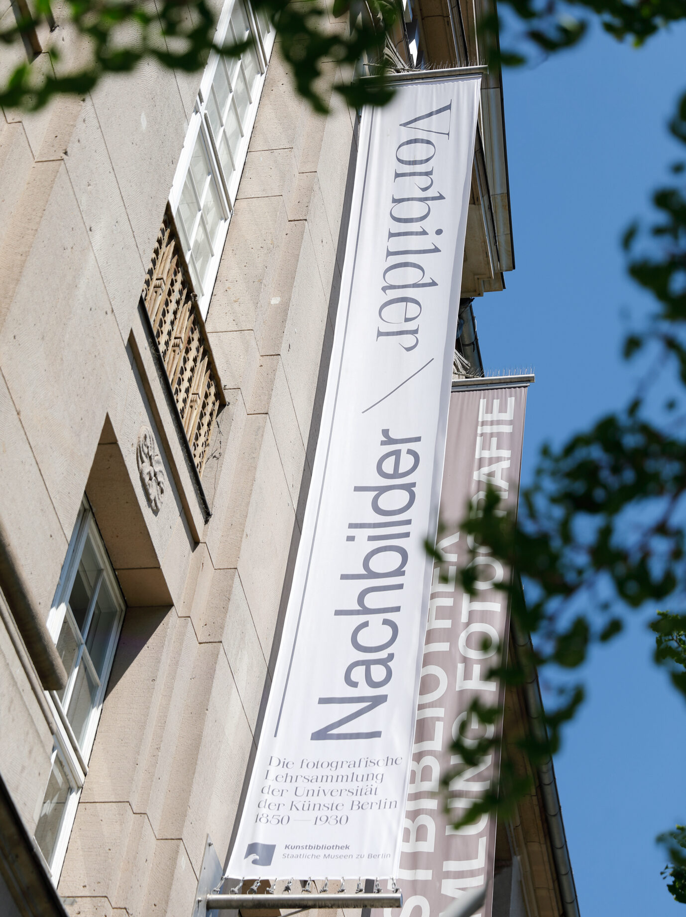
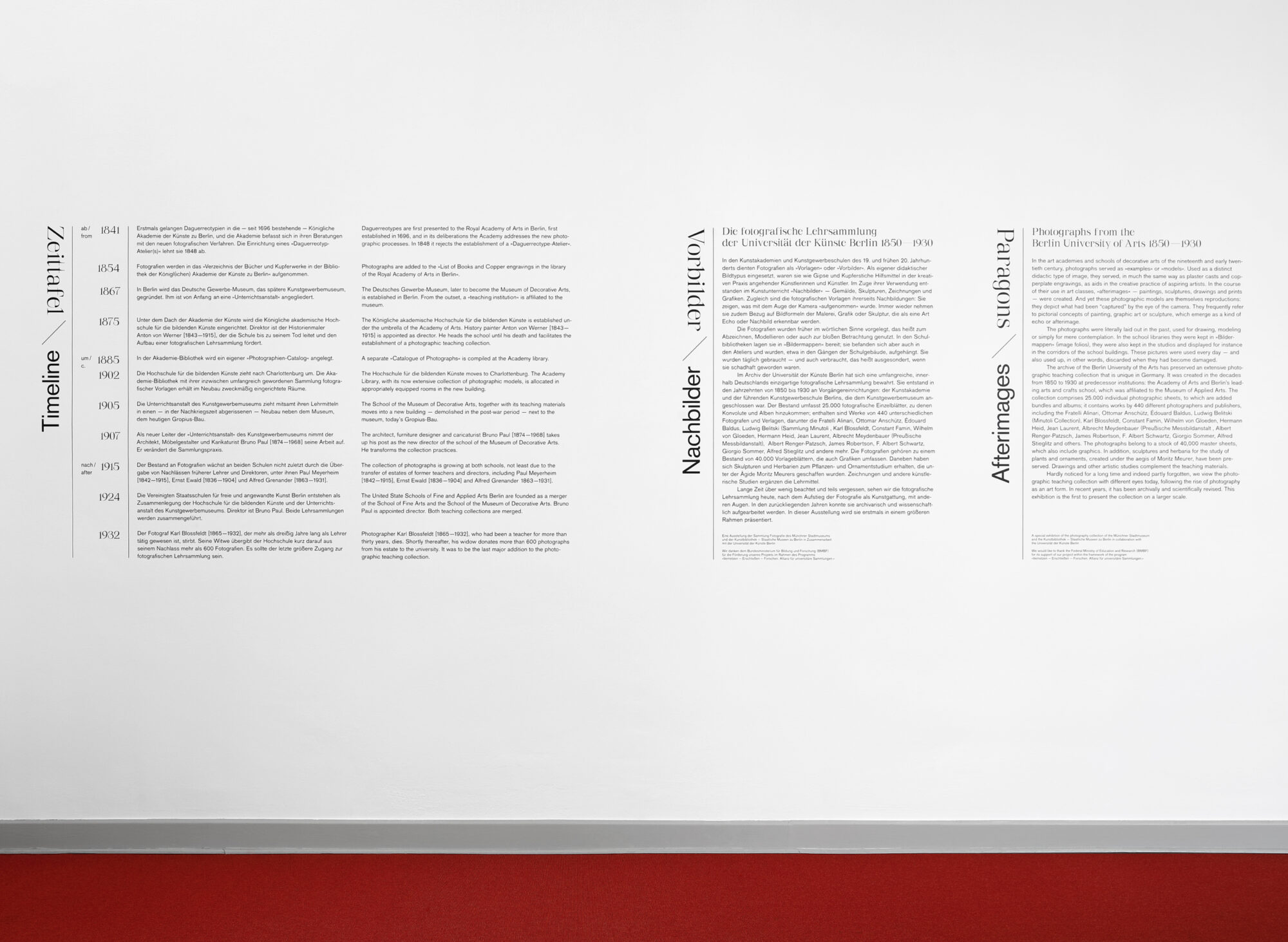
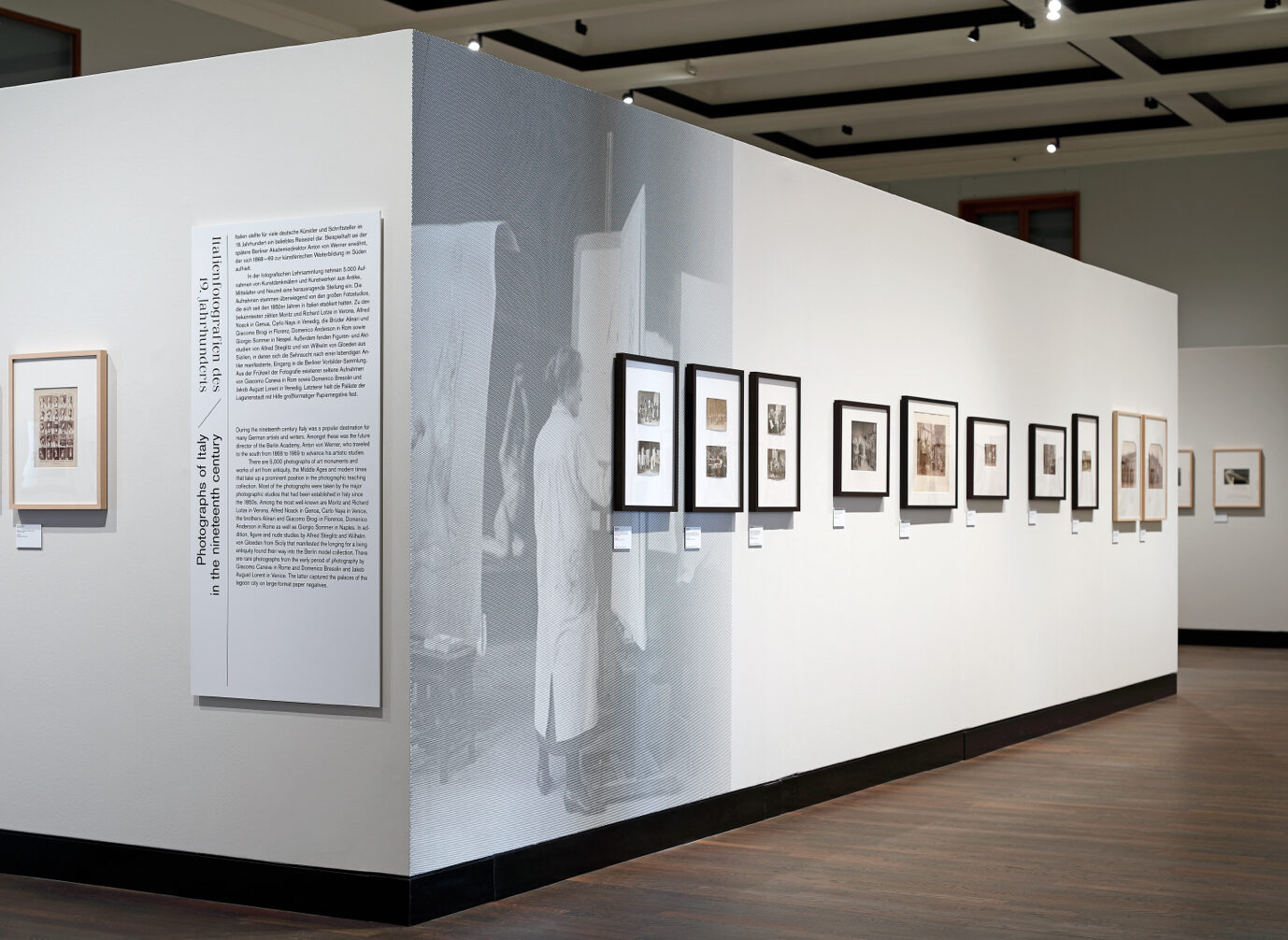
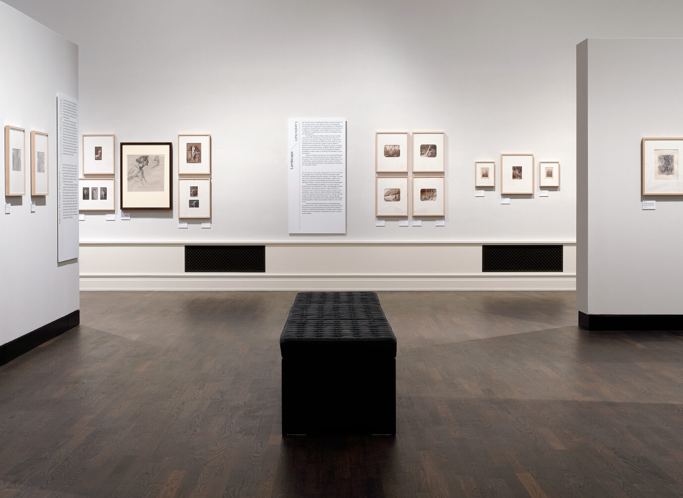
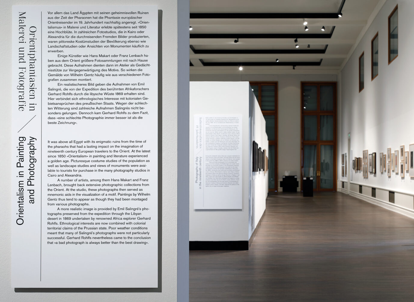
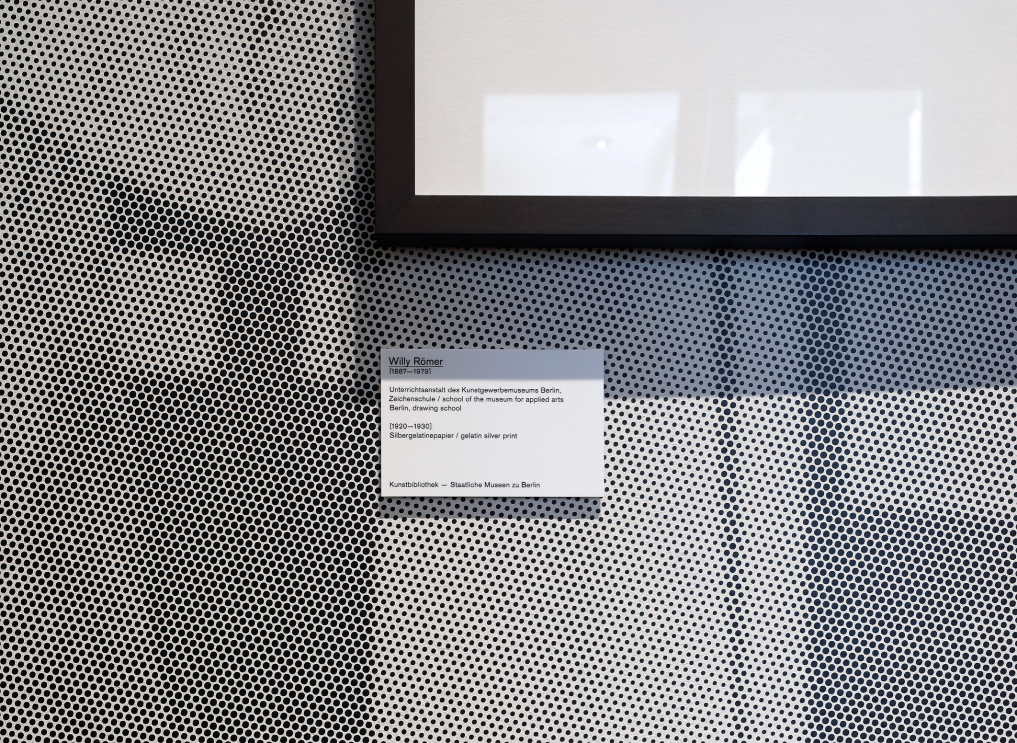
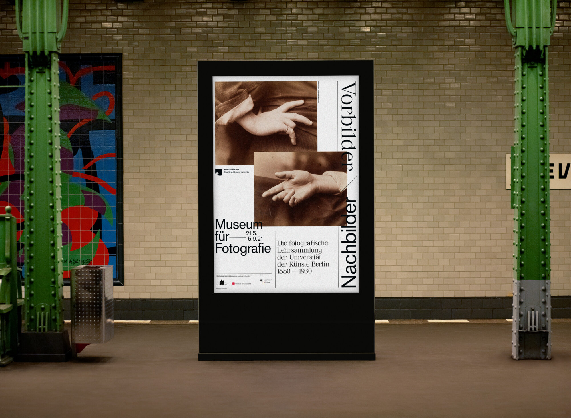
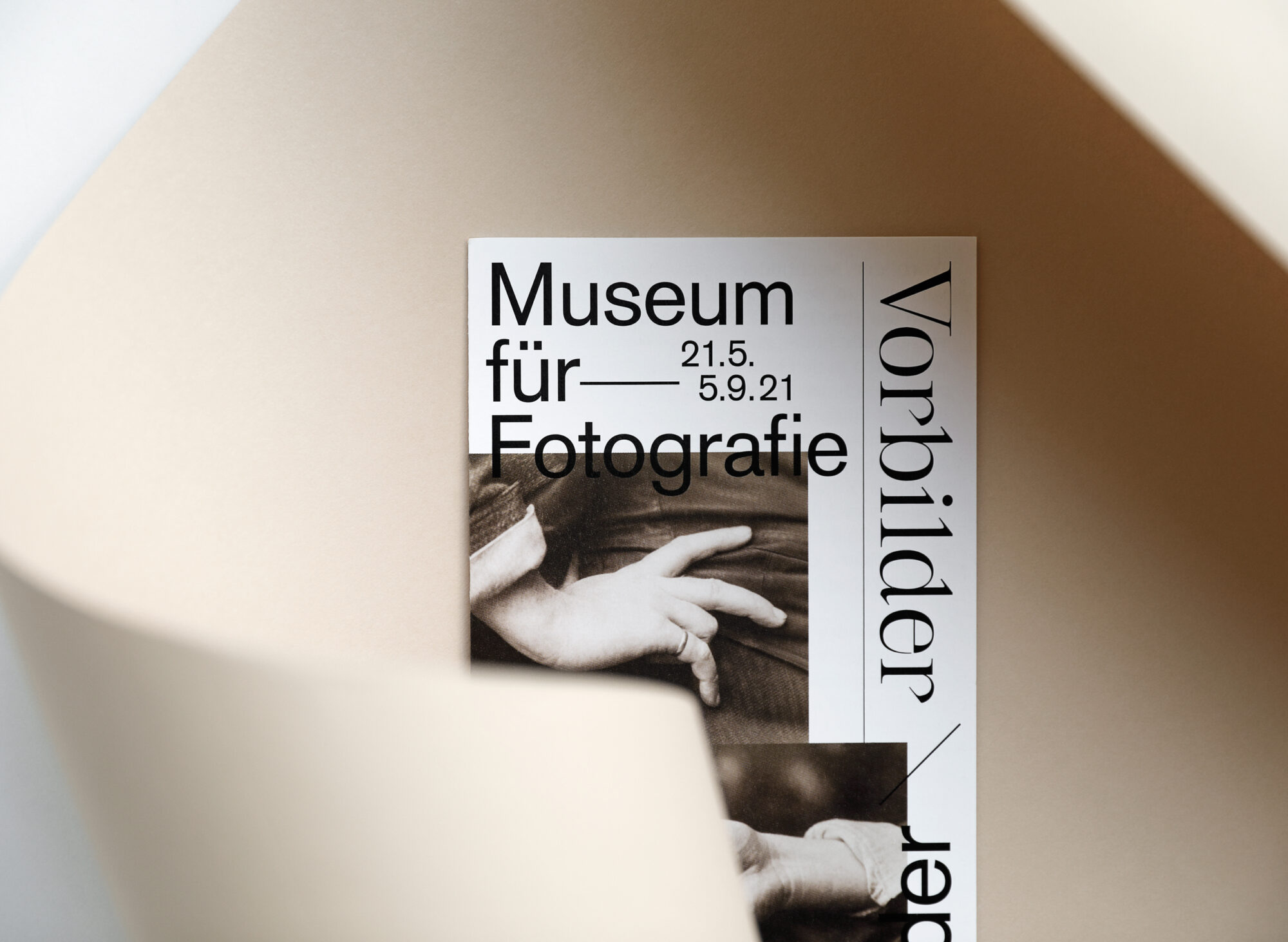
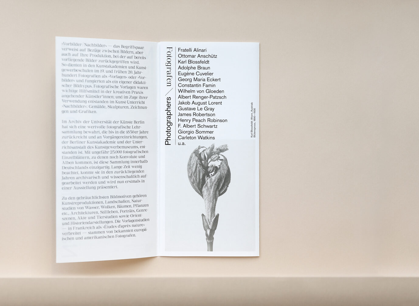
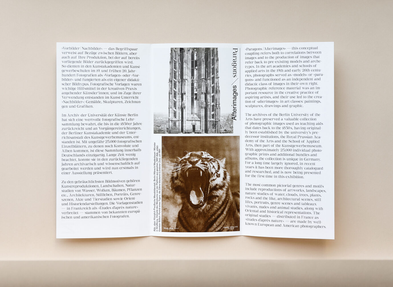
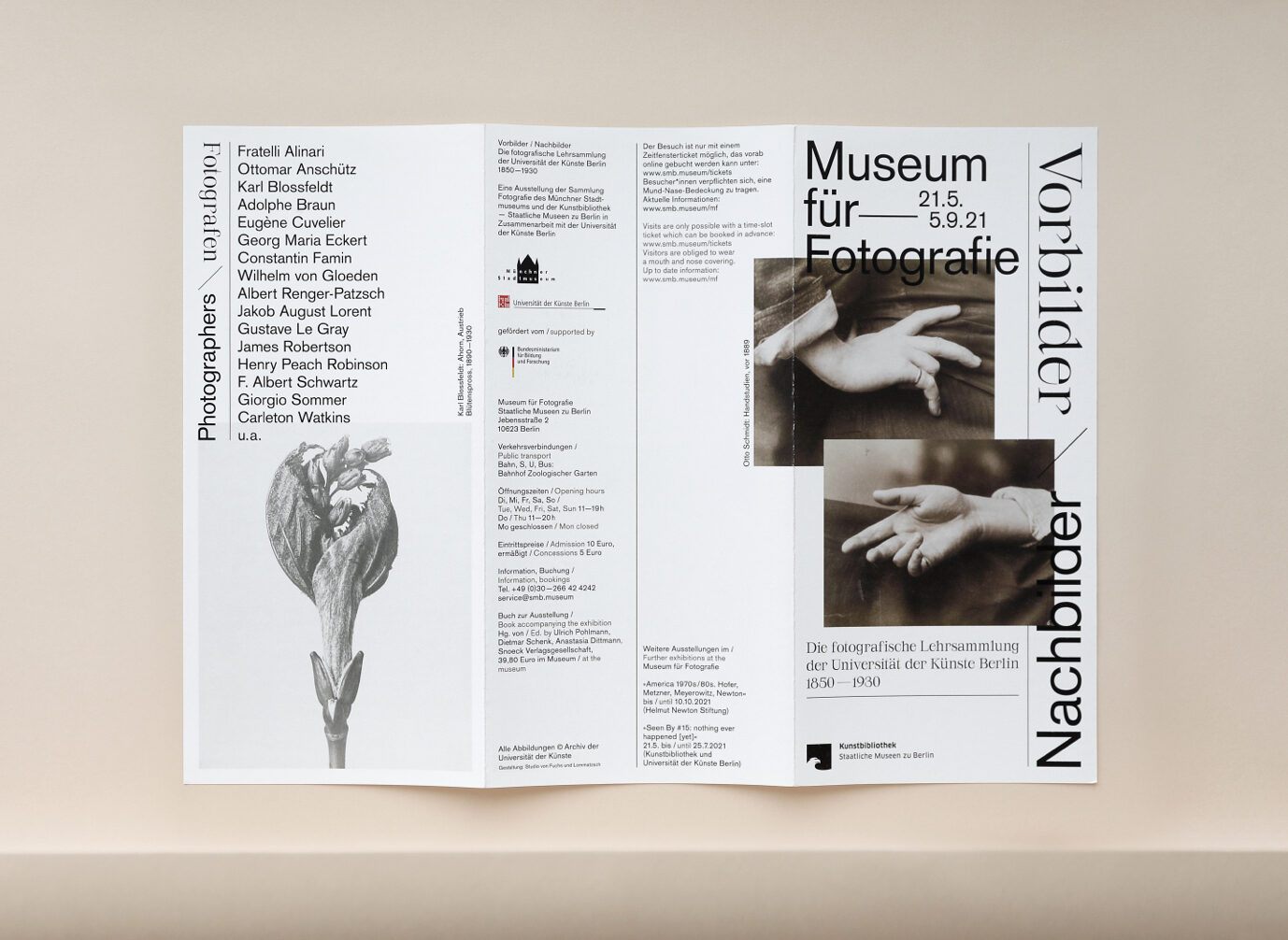
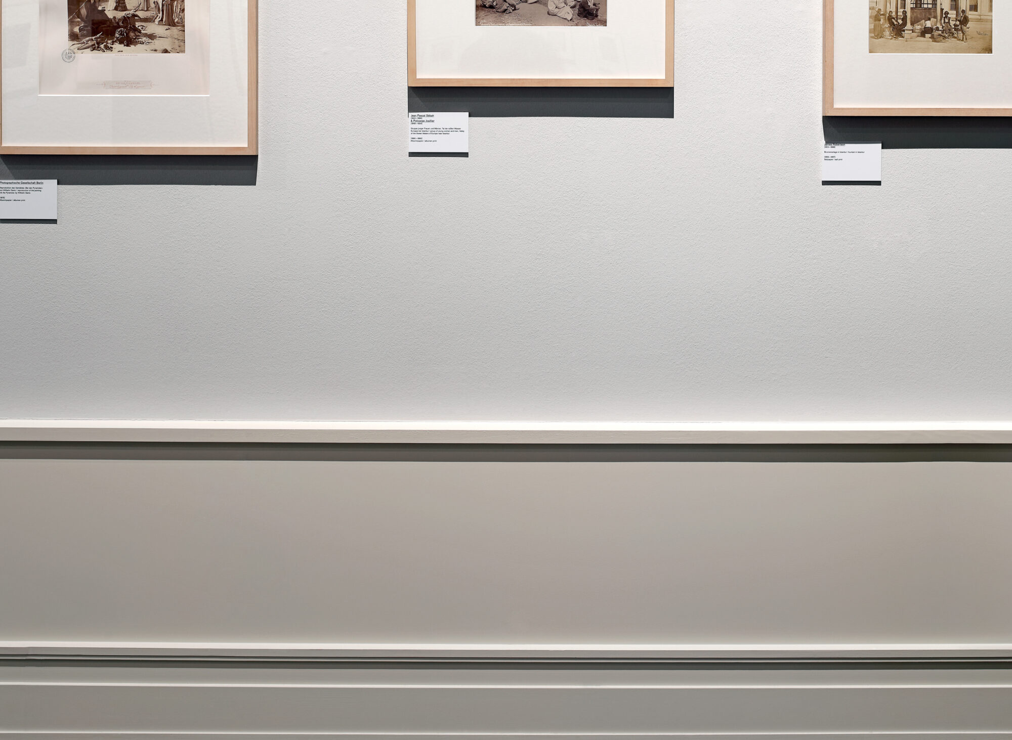
We developed the overall graphic concept for the exhibition and were responsible for the implementation of various media. The visual design reflects the reciprocal relationship between the »paragons and afterimages« by offering different ways of viewing the visual material. The wordmark developed for the exhibition plays with two typographically contrasting fonts, which also create references to visual translations and aesthetic shifts between »before« and »after«, »earlier« and »later«.
Fonts: Serifbabe / Charlotte Rohde, Basic Commercial / Linotype
